DIFC
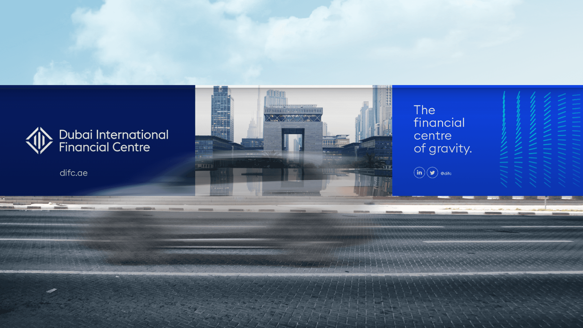
Challenge
The challenge for Dubai International Financial Centre (DIFC) was to develop a visually compelling identity that accurately reflected its core essence as a magnetic force attracting international investments and audiences to the region. The goal was to create a visual language that effectively conveyed DIFC's position as the leading global financial center in the MEASA region, connecting fast-growing markets with economies across Asia, Europe, and the Americas.
solution
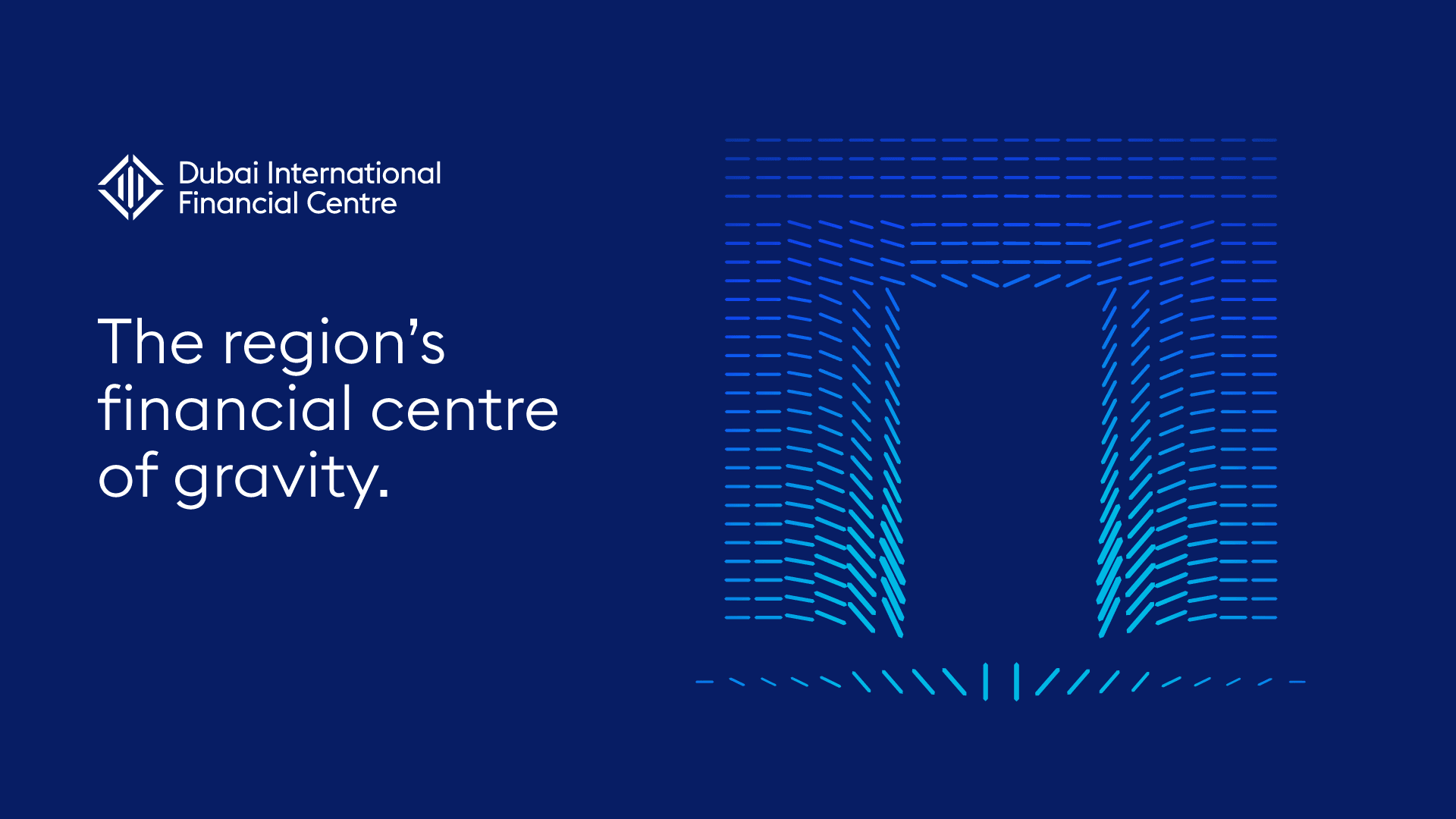
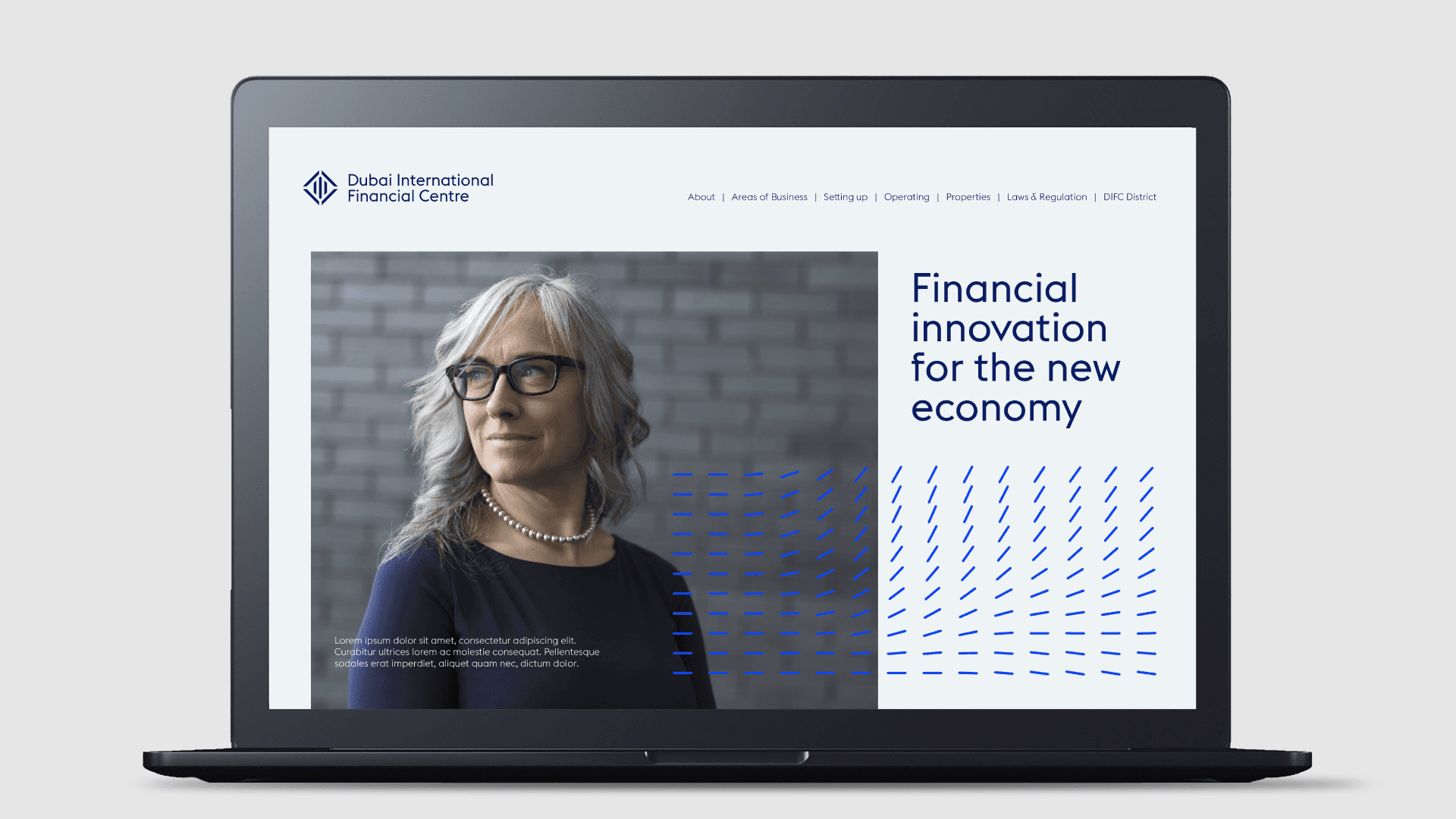
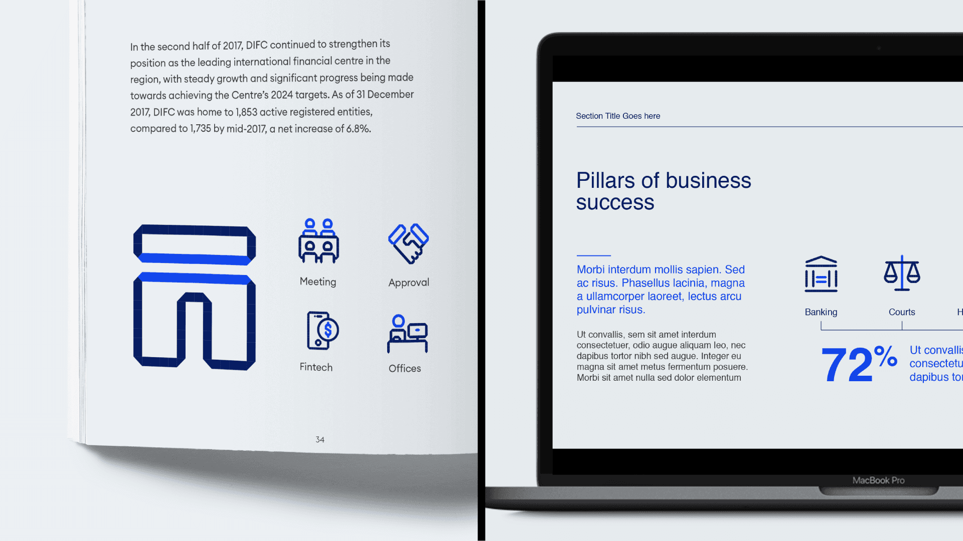
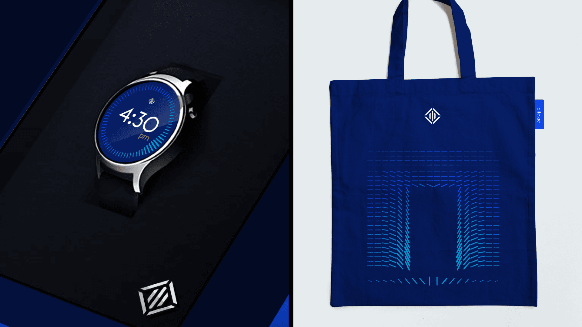
To overcome this challenge, a solution was devised to create a unique visual language inspired by the main element of the DIFC logo, "The Shard." The Shard was duplicated and harmoniously moved to create captivating stories and ideas, brought to life through static and animated applications. This visually dynamic approach effectively captured the essence of DIFC as a hub of international finance, showcasing its ability to attract investments and connect diverse economies.
Challenge
The challenge for Dubai International Financial Centre (DIFC) was to develop a visually compelling identity that accurately reflected its core essence as a magnetic force attracting international investments and audiences to the region. The goal was to create a visual language that effectively conveyed DIFC's position as the leading global financial center in the MEASA region, connecting fast-growing markets with economies across Asia, Europe, and the Americas.
solution
To overcome this challenge, a solution was devised to create a unique visual language inspired by the main element of the DIFC logo, "The Shard." The Shard was duplicated and harmoniously moved to create captivating stories and ideas, brought to life through static and animated applications. This visually dynamic approach effectively captured the essence of DIFC as a hub of international finance, showcasing its ability to attract investments and connect diverse economies.
CLIENT
DIFC
YEAR
2019
TYPE
BRANDING